Issue #57: Ugly/hard to read interface of edit user group
| Reported by: | Arnaud GUT |
| State: | new |
| Created on: | 2014-11-26 09:08 |
| Updated on: | 2015-08-06 20:34 |
Description
Issue with FF 33 and Chrome 38.
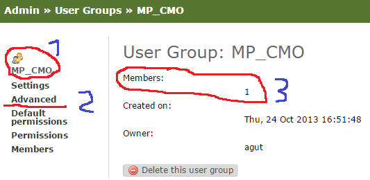
- Icon and user's group name not aligned
- Active "button" not highlighted
- Information not aligned on right side
See screenshot enclosed.
Attachments
Comments
Comment by Mads Kiilerich, on 2014-11-26 19:03
Yes. We are waiting for someone to contribute patches. You can probably find other areas that need cleanup more than this.
Comment by Thomas De Schampheleire, on 2015-08-06 20:32
(fix display of list in description)
Comment by Thomas De Schampheleire, on 2015-08-06 20:34
Item 1. is 'fixed' in the current version: that user group name and icon are simply not displayed anymore.
Item 2. is also fixed: a marker is added on the 'active' link.
Item 3. is still valid. In fact, it is caused by the usage of html definition lists which are meant for a term on the left side and a description of that term on the line below and the right side. I agree that this makes it look 'wrong'. The same principle is used on other Admin pages too. A fix should solve them all, preferably with some common CSS styling.
Contributions are very welcome: http://kallithea.readthedocs.org/en/latest/contributing.html